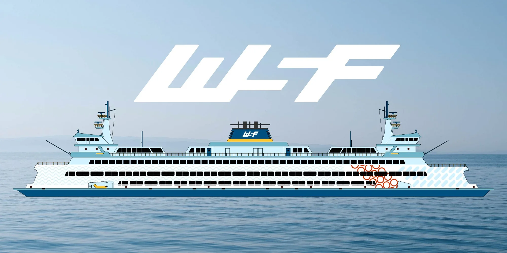
Washington State Ferries Branding
ROLES
branding
art direction
logo design
TIMEFRAME
10 weeks
TOOLS
InDesign
Illustrator
Photoshop
COLLABORATOR
Vaughn Meldrum
[concept work]
Challenge
As a governmental brand with a well-established reputation, Washington State Ferries has a legacy of reliable transit in the Puget Sound area. It was important to identify and honor their core brand values, and then deliver this cohesive branding across a variety of media platforms and collateral pieces. We wanted to achieve the same timeless, trustworthy feel in a vibrant and updated style.
Solution
A modified primary color palette supports WSF’s iconic identity and adds bold color to their collateral. We built a pattern library of simplified universal shapes to add richness and detail, and designed clarified wayfinding icons for an improved customer experience. Their marketing and customer outreach benefited from a refresh, and an increased focus on trip planning and mobile access increased usability for riders.


