ROLES
advertising
identity design
creative direction
video design
print
digital
TIMEFRAME
10 weeks
TOOLS
InDesign
After Effects
Illustrator
Photoshop
COLLABORATOR
Wynn Barnard
[concept work]
Challenge
Speaking to issues that matter to Seattle’s LGBTQIA+ (lesbian, gay, bisexual, transgender, queer, questioning, intersex, asexual, and ally) community, while also appealing to a broader audience. Walking the line between open, friendly celebration and serious political protest. Incorporating a wide range of faces and voices into a cohesive campaign. Building a singular visual identity that manages to represent the huge diversity of gender and sexuality without relying on a rainbow (and a rainbow color palette) to convey that concept.
Solution
Each year at Pride, LGBTQIA+ people from all walks of life celebrate a shared culture built on generations of struggle, love, and community. This year, Seattle Pride honors its radical roots and extends its horizons. A vibrant, gritty, in-your-face aesthetic pays homage to radical liberation movements that continue to shape queer culture.
This campaign highlights the allyship that strengthens the LGBTQIA+ community: white people fighting for racial justice, American citizens protecting undocumented people, cisgender folks showing up for their transgender siblings, people without disabilities demanding accessibility for all. There is a growing realization that the fight for queer rights does not — and cannot — exist in a vacuum. Pride continues to be a protest as well as a celebration, and that fight needs to be an intersectional one if it’s going to create lasting progress and change.
Visually, we wanted to honor the history of the Gay liberation moment. Our campaign’s aesthetic drew from the audacious, type-heavy, graphic style found within the signs, banners, zines, art, buttons, and protest actions of those who came before us. It’s vibrant and brash, grabs attention, and celebrates while it challenges.
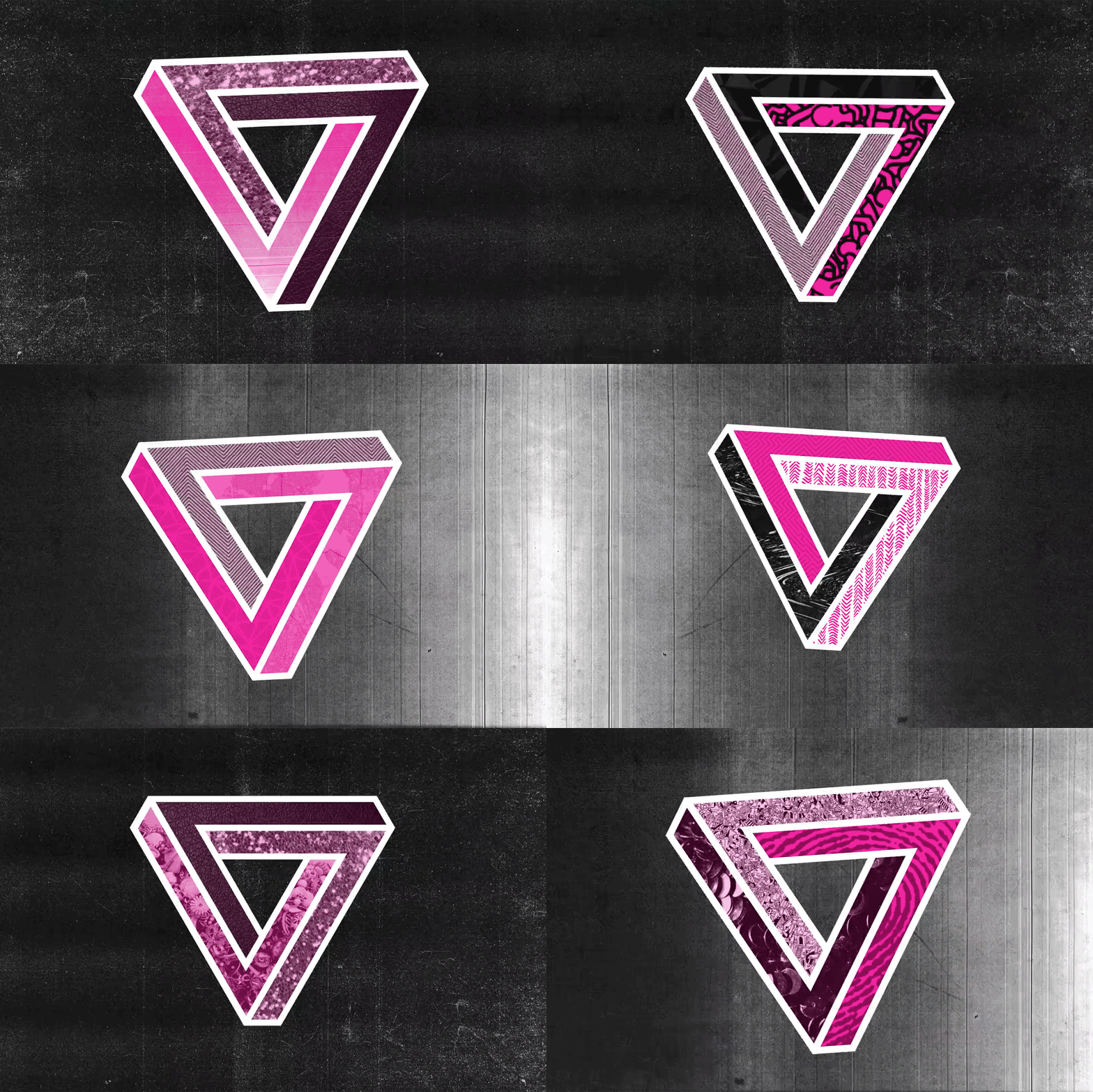
Our logo takes inspiration from the pink triangle, an enduring symbol of Gay pride reclaimed from its fraught Holocaust roots, and the Penrose Triangle, an Escher-like “impossible shape.” This symbol celebrates the common intersections of the queer community and the many dimensions of Pride today.
We challenged ourselves to limit our color palette for cohesive, immediately recognizable branding — while the rainbow flag is an important part of Pride imagery, from a design perspective, campaigns designed around the entire ROYGBIV spectrum can have decreased visual impact. We chose a joyful, fierce magenta, riffing on the historical pink triangle and providing a signature blaze of color against gritty black and white. A comprehensive pattern library of textures, prints, and manipulated photographs provides that all-important visual representation of the LGBTQIA+ community’s richness and diversity.
The campaign is purposely versatile and modular, inviting participants to claim the brand as their own. Our logo would be available to community groups, who could customize it with their own patterns. The open-ended and welcoming slogan “Pride Is” pairs with any of the numerous people, groups, and movements represented in the campaign, making that sense of inclusivity the point.
In keeping with Capitol Hill’s street art tradition, images of LGBTQIA+ icons such as Marsha P. Johnson, Harvey Milk, Audre Lorde, Sylvia Rivera, and Kate Bornstein would be provided for wheatpasting, along with logo stencils and magenta spray-chalk.
At the festival itself, participants could visit photo booths and button-making stations to collage images of themselves, their partners and families, and LGBTQIA+ heroes of past and present into pieces of wearable art.
Throughout the city, branded newspaper boxes would be filled with free Pride condoms and lubricant. This guerrilla marketing campaign is in keeping with the queer community’s history of public health organizing, vibrant sex positivity, and community accessibility.
A note about the campaign: two white queer people conceptualized and built this, drawing heavily from the organizing and scholarship of incredible communities who do intersectional work from the margins: queer and trans people of color, disabled queers, Muslim queers, undocumented queers, HIV positive queers, and countless others. We intend our work to support and amplify the labor that has gone into this organizing for generations.
A radical aesthetic is meaningless unless it is backed up with action and resources. What you see here is proof of concept; once actualized, the messaging, photography and overall representation would be chosen by a board of members representing the many groups that make up our collective LGBTQIA+ community.
This community board would identify campaigns and organizations working at the intersections of queerness and economic justice, racial justice, immigration reform, anti-Islamophobia, disability rights, health and housing reform, and other critical social justice movements of our time. We would intend to leverage this platform for redirecting resources to groups fighting for a deeper and more honest sense of equity in our communities.


