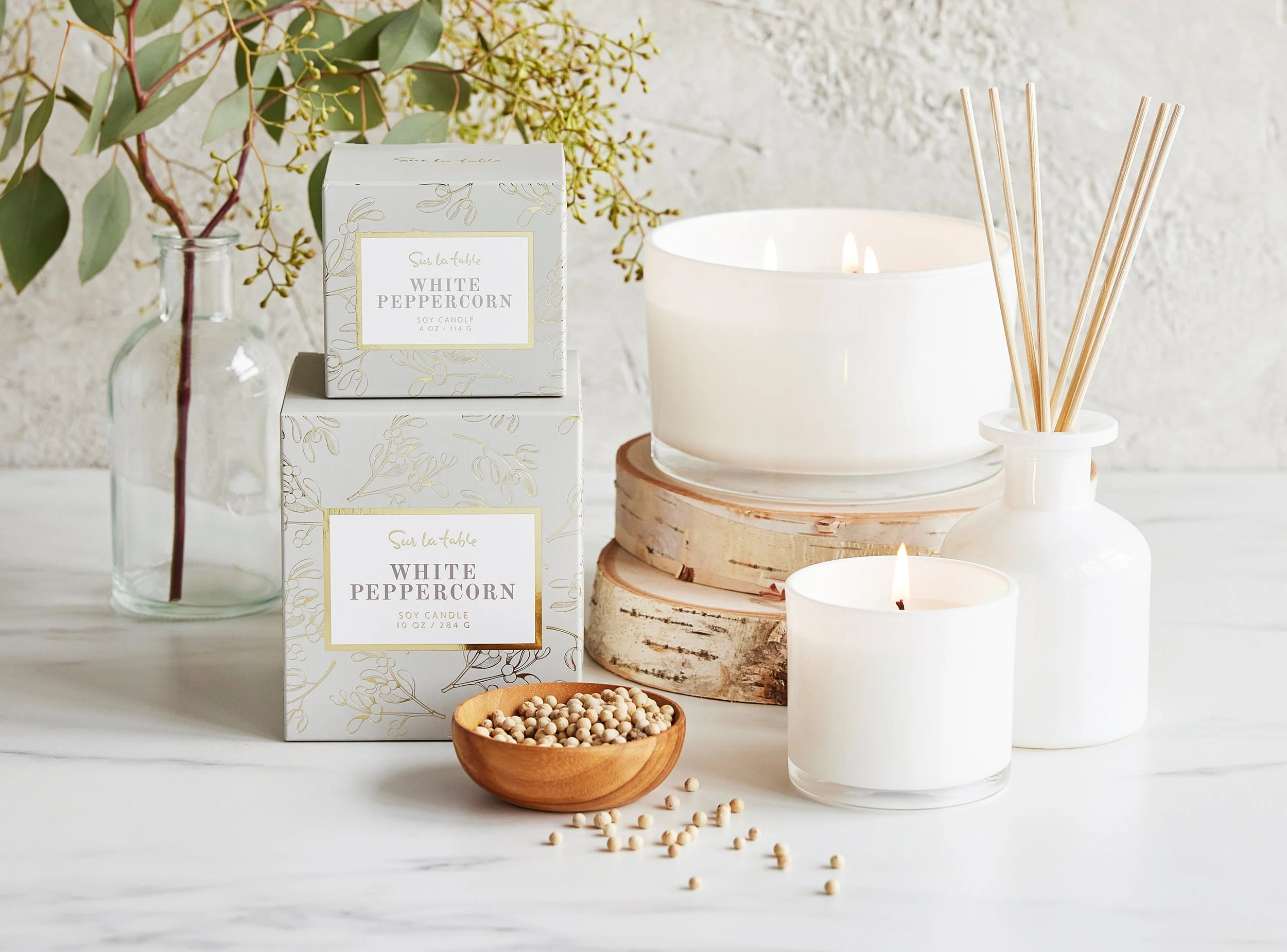
Sur La Table Seasonal Fragrance
ROLES
identity design
creative direction
packaging
TIMEFRAME
6 weeks
TOOLS
Illustrator
Challenge
Develop coordinating fall and winter home fragrance collections, echoing the clean botanical feel of Sur La Table’s core soaps and lotions, but with a more premium finish for holiday gifting. All the products in this collection needed to make sense with both distinct campaigns for fall and winter, since both seasons’ merchandise would overlap in stores during the back half of the year. This complicated the brief — while the Autumn 2021 aesthetic felt cozy, understated, and folkloric, Holiday 2021’s cheery, kitschy maximalist tone could hardly look more different.
However, the biggest pain point was timing, not design. In early 2021, packaging production (along with much of the merchandise) was mired in supply-chain issues due to the pandemic; all timelines for Q3+Q4 2021 packaging creative were cut roughly in half in order to accommodate a substantially expedited production and shipping schedule to still meet seasonal deadlines.
On the scale of practical to non-essential products, home fragrance is purely a mood, a treat, a splurge, a sensory delight, and packaging is key to convey that convincingly. How could I deliver a unified, thoughtful, creatively rich collection that ticked all of the merchandise team’s requirements, but in a greatly reduced timeframe?
Solution
To bridge both seasonal moodboards and still nod to SLT’s core fragrance products, I sourced botanical etchings with a unified illustrative style and line weight, then built out a suite of repeating patterns, all of which depicted or hinted at botanicals that made up each scent. (For instance, we determined that actual chestnuts might not be immediately recognizable to a customer, but acorns and oak leaves would evoke a similar warm autumnal scent with a quicker visual read.)
Gold foiling details and a dignified old-style serif helped build a sense of luxury. I color-matched PMS swatches from the Pantone TPG+TCXs in the merchandise seasonal campaign style guides so that this fragrance suite would fit in seamlessly with SLT’s tabletop and linen collections for both fall and winter, and I played with tints and shades in the palette to add richness.
The fall fragrance collection was made up of a smaller tinned candle and a larger jarred candle in two scents each.
After the fall packaging creative had gone into production, I received the specs for the winter collection, which consisted of three new fragrances across a new range of products: candles in three sizes each, a diffuser, and a candle and diffuser set, as well as a gift set of all three candle scents. The merch team sourced a vendor with the resources for more premium packaging, which meant boxed products instead of just labels on the products themselves. I adapted the look and feel of the fall collection to boxes, adding even more lavish gold foiling details to match the maximalism of the winter campaign.
Timing and supply limitations meant that the vendors weren’t able to print directly on the candle containers. The high-end glass vessels looked elegant and clean enough to stand on their own aesthetically, but this also meant that all ornamentation and branding came down to the external packaging. We were able to arrange double-sided printing for the cardstock, so that when the box was opened, the white glass candle contrasted beautifully with the rich full-bleed color interior of the box (a slightly deeper shade of the exterior background color).
The final count for this collection came to 64 distinct dielines across 20 products and 5 fragrances, including top and side labels, boxes, and candle dust covers, plus underside stickers with company details and legally-mandated safety information. This was my first experience designing a suite of packaging that needed to meet ASTM fire-safety labelling standards, and I fought to display all the required verbiage and iconography (all with its own minimum size requirements) without sacrificing the richness and beauty of the packaging design.
Conceptualizing a unified look and feel for this multi-season collection and building out all the assets with such a tight turnaround required elevated project management and collaberation. I worked closely with the merch team, handling everything from practical considerations like in-store merchandising floorplans to design concerns about aligning with seasonal trend forecasts, as well as troubleshooting time-sensitive issues with our overseas suppliers across time zones and language barriers.


