Le Petit Paquet Restaurant Identity Design
ROLES
identity design
creative direction
copywriting
print
digital
TIMEFRAME
6 weeks
TOOLS
Illustrator
JUMP TO
Branding Process
Final Branding
Brand Language
Collateral
Challenge
Chef-owner Zephyr Paquette has long been a fixture in Seattle’s culinary scene, over the years making her mark on foodie meccas like Dandelion, Marjorie, Café Flora, and her own restaurant Skelly and the Bean. She was taking over an existing restaurant whose owner was retiring, and transforming it slowly but surely into the new concept (Le Petit Paquet, French for "the little package" — a cheeky play on Paquette’s last name), and needed both a comprehensive brand identity as well as a whole suite of digital and physical assets. As LPP would be staying open through the transition, this meant strategically building out functional basics to get the new branded concept up and running, while also taking into account plans for future projects and developments.
Paquette’s concept for Le Petit Paquet: a beachside bistro with picnic-y grab-n-go vibes, focusing on pizza, experimental small plates, cold salads, pasta, and wine and cocktails. She wanted to create a laid-back neighborhood atmosphere paired with a bright, fresh, inventive menu. In addition, the owners requested that the final palette include a sky blue and a butter yellow, as the interior was already being painted in both colors.
Branding Process
This brief was honestly a delight for me — restaurants are inherently celebratory, sensory-rich, inspiring subjects to brand, and I had lots of creative freedom to explore different aspects of Le Petit Paquet’s character. What a joy to singlehandedly create the entire look and feel of the LPP universe, from online presence to the actual physical experience of the meal! Based on my conversations with Paquette, I developed four distinct creative directions to give the owners a good range of options for initial discussion.
Option 1: cheeky / energetic / unfussy / playful
Les poissons! A playful interpretation French maritime style, as fresh and bright as a new Breton striped shirt. Hand-drawn elements and lettering kept things from veering into cliche a la Francois. Here I envisioned "the little package" as the universally-recognized brown paper bag.
—
Option 2: trusted / clever / experimental / imaginative
My clients dreamed of becoming a best-kept neighborhood secret — that kind of unassuming place that becomes legendary through word of mouth — so I dabbled in Freemasonry visuals and a more conservative palette to create a Very Serious Secret Picnic Society. The little package? It’s a picnic basket full of mysteries.
—
Option 3: welcoming / effortless / open-minded / delightful
Drawing inspiration from bakery order slips and packaging, this look came together with custom type and a color scheme that added a sense of craft and sturdiness to the pink of a traditional bakery box — that sense of treating yourself to a delectable surprise even though it’s a humdrum Wednesday.
—
Option 4: serene / relatable / timeless / elegant
Classic dimensional lettering nods to the front windows of traditional French and Italian sidewalk brasseries, and an emblem based on the old-school deli "take a number" ticket machine ticket gives a vintage hand-touched vibe. Eavesdrop on the patio late into the night and tell them to leave the carafe of the house red.
—
Final Branding
The timeless appeal of the fourth design direction won my clients’ hearts. We landed on a rich sunny palette with a relaxed, beachy feel. They loved the deli ticket icon I had designed, but were interested in the concepts of some of the imagery from other design directions to help represent different facets of Le Petit Paquet, so I built out a unified suite of four more icons in the style of the deli ticket: a wine bottle for their extensive wine and alcohol list, a picnic basket representing their plans for a gourmet picnics-to-go program, a paper bag for the takeout menu, and a seashell to celebrate their proximity to the water.
Brand Language
As the only creative working on this restaurant launch, I wore many hats, including copywriter. I started with some market research, gathering taglines and mission statements from four or five dozen of the Seattle area’s most critically acclaimed restaurants to get a sense of what subjects they prioritized in their brand language. From this list, the owners prioritized which topics LPP wanted to highlight in their mission statement, focusing on their beach-adjacent location, the idea of being a casual, fun neighborhood staple, and the unfussy yet high-quality food.
Taglines always feel like the trickiest piece of language to nail, because how do you capture a brand’s tone, mood, and ethos in just a brief phrase? Here are some of my initial draft concepts:
Everyday delights, elevated
Celebrate the everyday
Local, seasonal, joyful, curious
An everyday feast
Bring joy to the ordinary
Simple pleasures are best
Make every day a picnic
Full hearts + empty bellies
In the end, we landed on:
Picnic is a state of mind.
This felt the most authentic to Le Petit Paquet’s ethos, and also the most encompassing of Paquette’s many future plans for the restaurant. Whether folks grab sandwiches and Capri-Sun-style pouches of boozy slushies to take to the beach, or are trying some experimental small plates in the backyard seating area with the dogs running around, or are just chowing down on an amazing specialty pie with local seasonal ingredients and a warming cocktail in the interminable middle of a soggy and dark Seattle February, that picnic vibe — impromptu, delicious, unfussy, fresh, celebratory — is always there at LPP. Here’s the final tagline and mission statement:
Collateral
When it came to physical print assets, signage was top priority: getting new Lexan polycarbonate transparent vinyl panels in production for the existing lightbox sign cabinet. Digital priorities were launching a straightforward branded website with an easily-editable live text menu that the owners could update on the fly, as well as building out assets for their robust social media presence.
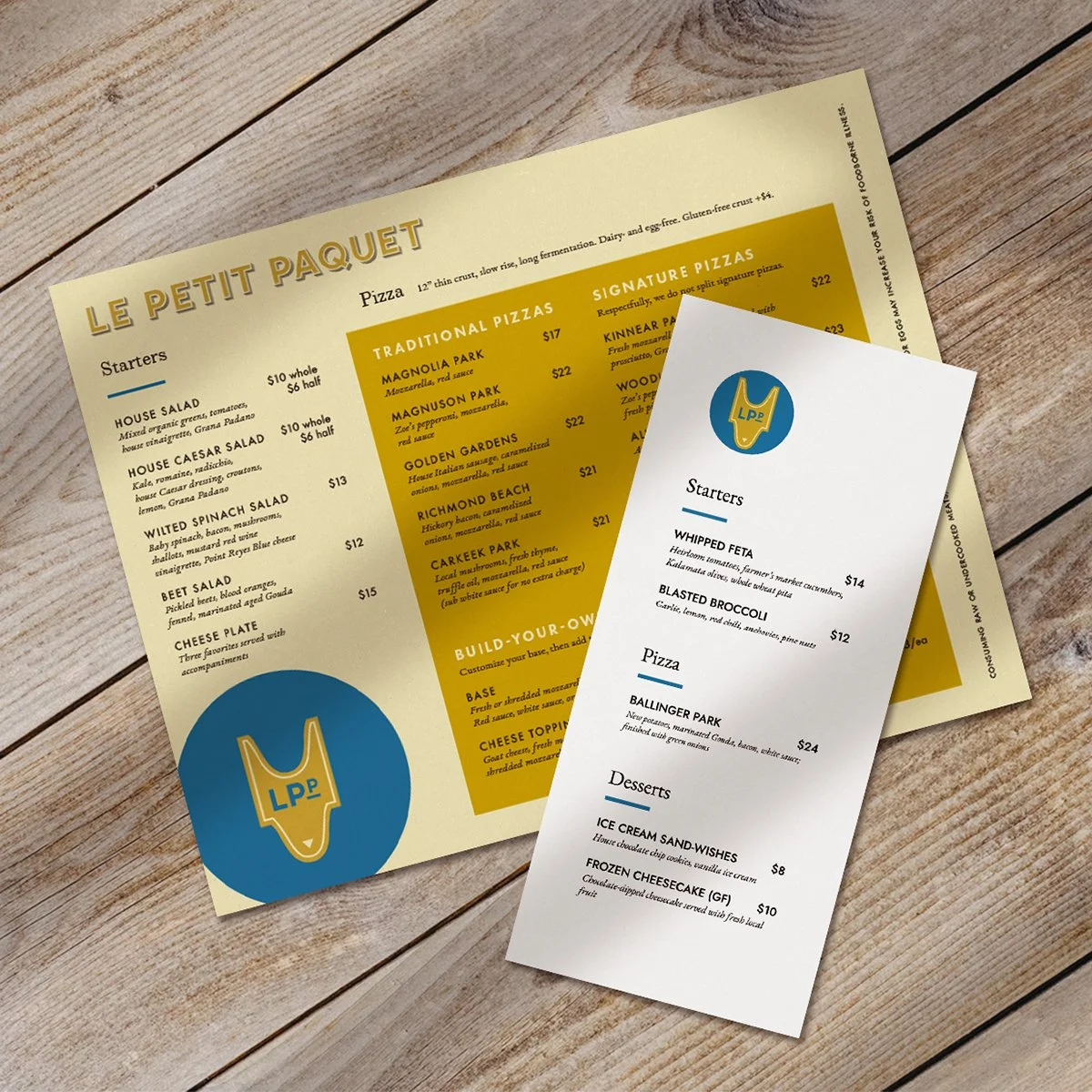
Phase two focused on print collateral: a menu and wine list, a branded fresh sheet template that the owners could confidently update and print in-house on a daily basis without designer input, and business cards. We’re working with one of the last water-gilded gold-leaf lettering artists in the region to continue establishing LPP’s brand presence from the street.
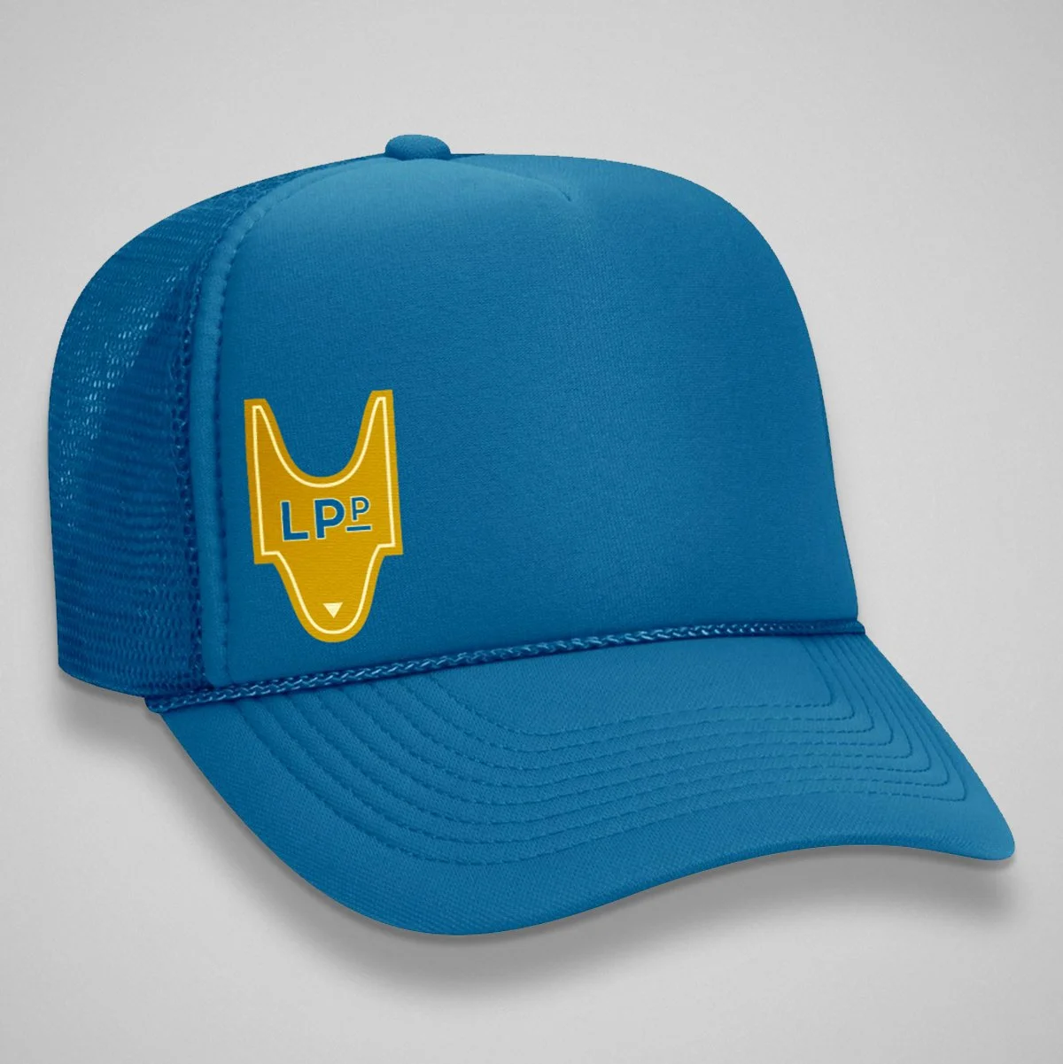
Our next batch of collateral will include branded merchandise like a trucker hat (Paquette’s signature snapback is legendary), a koozie for keeping canned cocktails chilled on the beach — the perfect LPP concept of highbrow meets informal, with a wink. Stickers of the icon suite will be great customer merch in addition to serving as back-of-house communication and packaging for orders (takeout, wine, to-go, picnic, etc).


